As I deal a lot with system control block diagrams, I feel in power to say something about synth block diagrams, as they seem to have a lot in common. I analysed a lot of drawings from different synthesizer manufacturers and decided to create my own Inkscape template to simplify my documentation process. So if you are already feeling bored just skip to the bottom of article, as I am going to complain a lot.
Why do we need rules ?
Synths are all about signals – their generation, processing and routing (duh!). All those things will be reflected in a synth block diagram. You can create your own rules of drawing – but you must follow them. Tight rules will increase chances the future users of your equipment will understand what you try to tell them. I think the most important guideline for all kind of diagrams and schematic: keep them consistent. Lets move to some examples, shall we?
Moog Grandmother example (warning: tons of complains)
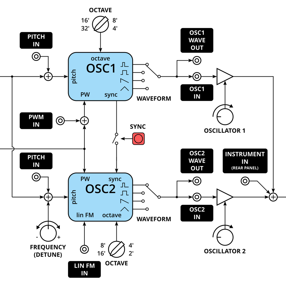
To show what am I talking about, lets look at following example of inconsistency (from Moog Grandmother official user manual). The first question: What accually the box represents? If you look carefully: a generator or signal processor (ENV, NOISE, SPRING REVERB), a part of user interface/function (SYNC), input or output (MOD RATE IN, LIN FM). You can used to it, but still it is hard to read.
Because there are no arrows to show the signal flow direction, you have to trace the signal to knew what it represents. For example, try to trace top signal from/to LADDER FILTER. You can tell it’s a cutoff modulation from MOD OSC. But what the signal to FILTER from ENV AMT does? Probably also modulates cutoff, but you can never be shure 🙂 Can you tell, which OSC is synced to which? No. Everything should be clear from the beginning, without guesses, which here is not.
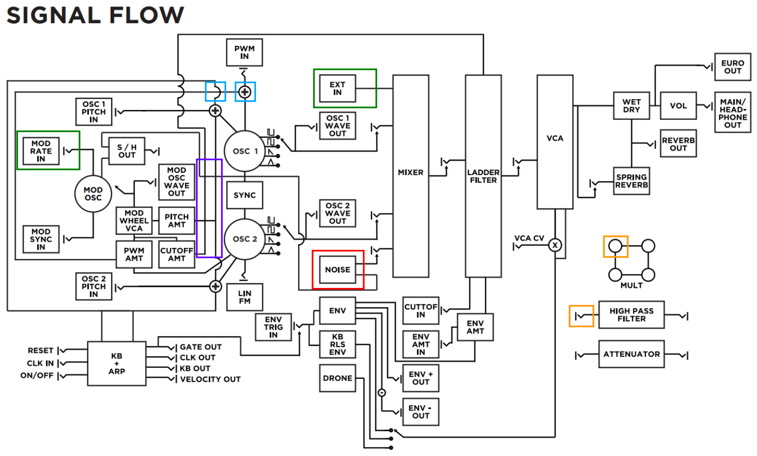
But you can notice stranger things:
- separate symbols are used (in blue rectangles) for “not connected” (∩), “connected/summed” (+); then what is happening here – some kind of fancy multisplit? (consistent use of “not connected” and an addtional dot for “splitted/connected” would help to figure out what is going on),
- MOD RATE IN uses “jack” symbol, but EXT IN to mixer not,
- there are 2 symbols used for input/output: “jack” and a circle,
- generators are marked with circles, but NOISE generator not (maybe it is a way to mark audio voltage controlled ones?),
- every input/output label is surrounded by rectangle, but those near KB+ARP are not,
- “switch” near MOD OSC seems incomplete, I believe there should be outputs with waveform drawnings as for main audio generators,
- lack of MIXER OUT and FILTER OUT jacks (they exist on Grandmother front panel),
- inconsistency in naming, PWM IN, but LIN FM; LADDER FILTER vs HIGH PASS FILTER; KB and KBD as double abbreviation from keyboard (used on front panel),
- what is happening near VCA CV? Signal split? Bypass?
Ok, maybe I’m a bit to harsh and just understood intents of the Grandmothers diagram designer incorrectly. After all those complains I must say: Grandmothers manual is really great!
Korg MS-20 example (less complaining)
Let’s look at the block diagram of the Korg MS-20, a synth with a complexity similar to Moog Grandmother. Main audio signal path is on the top of chart, with modulation sources under it. Every grey block has a clear function – a signal generator or processor. Inside a block all physical controls are listed, so you know what to expect from the user interface. Waveform visualisations with voltage levels and VCA/amplifiers as triangles are a nice touch. But also here some things could be done better:
- I think it is nice to have all audio generators close to each other, to have clear view of synthesis chain; NOISE GEN placed f.e. somewhere near VCO1 would shorten length of path between them and made whole look more transparent,
- most of the modulation chain singnal flows from right to left (which at first glance can resemble a feedback path),
- no list of output waveforms generated by VCOs (it is a useful thing, especially if you look at new synth block diagram and want to know its capabilities),
- personally I don’t like how the potentiometer is defined (with electronic part symbol), as it implies a lot of unnecessary questions about internal structure (Why are the mixer potentiometers connected this way? There should be voltage dividers! etc.); more “abstract” representation would work better. (Some block diagrams, like the one for “Clangora” designed by Thomas Henry try to deal with it by using potentiometer symbols and thus ground symbols if pot is used as voltage divider, but this leads to an overkill.)
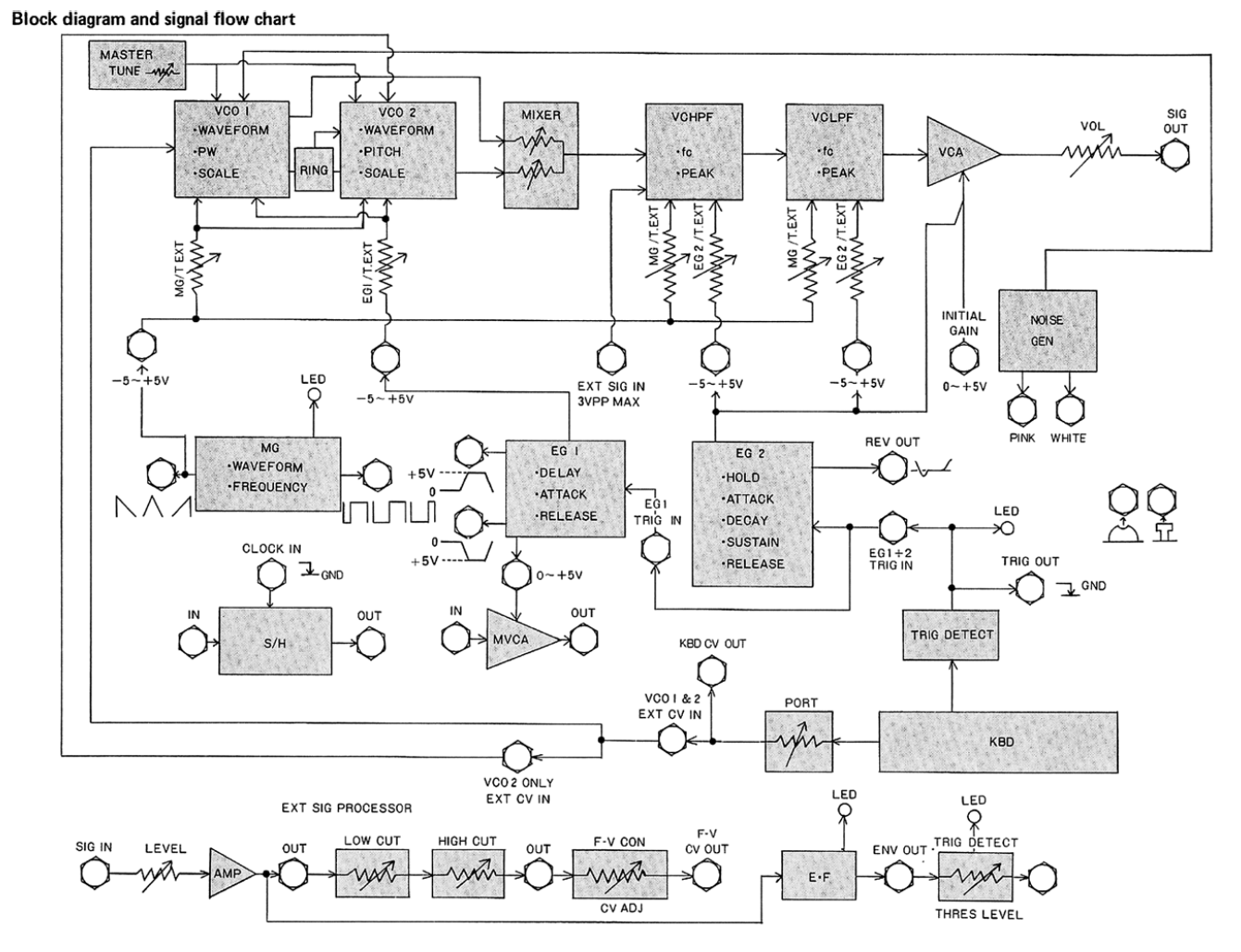
When drawing synth block diagrams, an often problem with mixer section occurs: on the one side it is a signal processor, on the other just an amplifier. In later diagrams Korg draw it as a set of “triangle” amplifiers with summed outputs and I thing this approach is the most legible. You can check it on Korg Monologue diagram presented below.
Korg Monologue example (almost no complaining)
That it would not look like I am some kind of Korg fanboy, look at diagram of Monologue. Literally a big step back. In comparison to this, MS-20 one is outstanding. Figure out for yourself what could be done better!
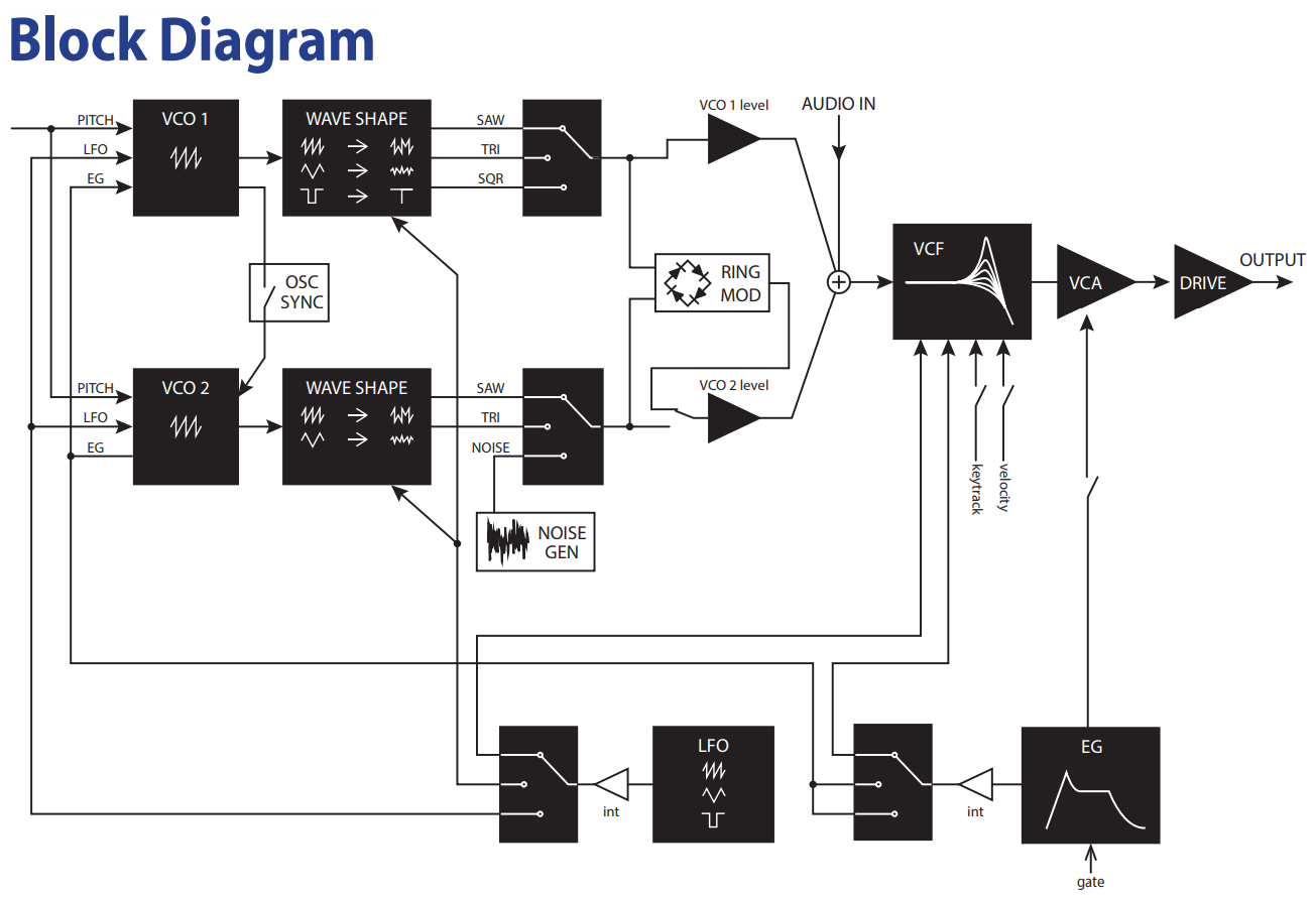
Ok, just few things (in random order):
- there are VCO waveform selection switches – why not for LFO?
- what LFO/EG signal coming to VCO affects?
- what I/O signals are avaliable to user via jacks?
- lack of some signal labels (CUTOFF modulation is a quess) and switch labels,
- why RING MOD and NOISE GEN “boxes” are different?
- no sequencer section,
- eyes hurting from tracking long, crossing traces (MS-20 scheme also has a lot of them, but is also a way more complex).
Sad to say, another chance of showing user a lot of useful information was wasted.
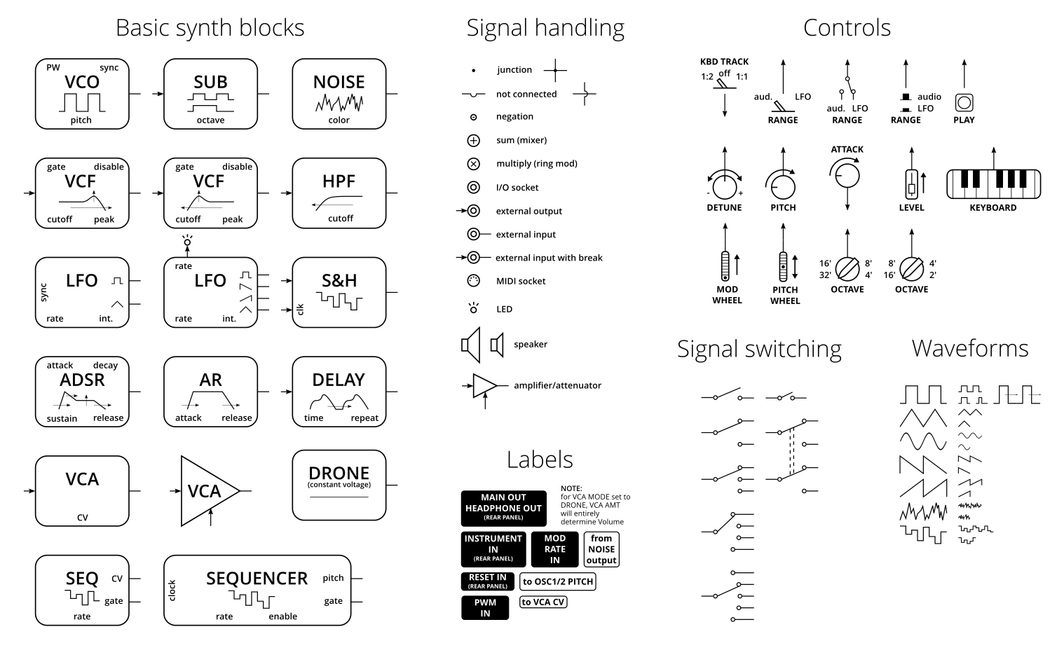
My guidelines to synth block diagrams
Time for me! I think a block diagram is a great way to present a condensed information about synthesizers features. General rules for block diagrams I (try to) use are:
- main (audio) signal flow from the left side to right, which implies,
- input is on the left side of basic synth building block and output on the right,
- each signal should have a direction marked with arrow,
- when two signals are splitted, their junction is marked with dot, and…
- …if they meet together, an action must be performed (adding, multiplying).
Additional and very helpful:
- if signals are not connected, it should be marked somehow; lack of dot is not an information (it is a common problem with old electronic schematic: was there a dot, or designer forgot to place it, or it is just an error in scanning),
- keep blocks sharing similar functionality together (generators, filters, etc.),
- avoid long paths between blocks – place blocks closer together, use labels (like f.e. in MFOS synth block diagrams)
- show user interface controls (listed in block or “connected to its top and bottom”),
- distinguish amplification blocks, use triangles,
- add info: 1 V/oct inputs/outputs, voltage levels, unusual behaviour notes.
My synth block diagram template was strongly inspired by the one from Korg Monotron manual, just slightly tweaked. As I said a lot of unpleasant things about Moog Grandmother block diagram, I decided to redesign it on my own.
Moog Grandmother block diagram, redesigned
This is what my attempt to show how the Moog Grandmother functionality looks like. It would be a failure if it turned out to be worse then original 🙂 I double-checked it and really tried to avoid any errors.
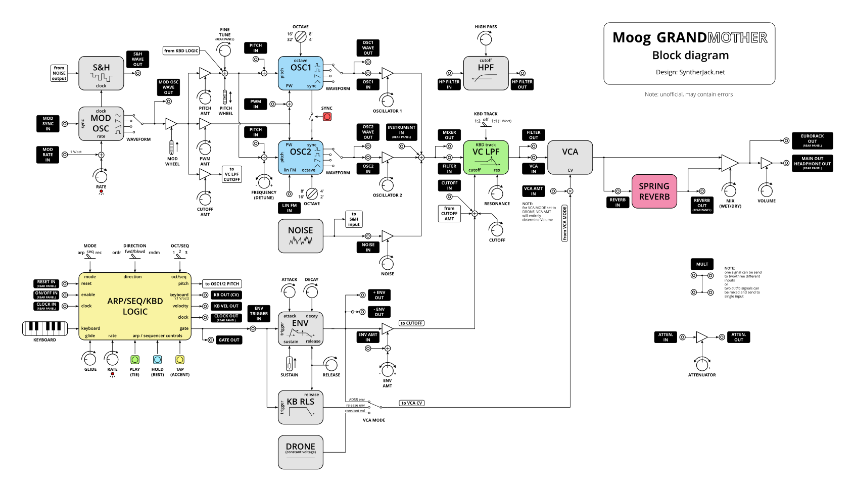
It may not be perfect, but is close to what I have imagined. I thought it will be smaller 🙂 Lets look closer what have I changed in comparison to original Moog diagram:
- clear signal flow, from left to right,
- long traces are using labels – f.e. from NOISE to S&H,
- controls and I/O labels same as used on phisical device, …
- … but I’ve chanced names of some blocks, like LADDER FILTER to VC LPF and HIGH PASS to HPF, as original names don’t tell you what are you really dealing with,
- all inputs and outputs have black labels and are visible at sight, those on rear panel are extra marked,
- blocks with similar functionality are grouped, f.e. [OSC1, OSC2, NOISE] and [VC LPF and HPF],
- distinctive Grandmother color scheme for oscillators, filter, reverb and arpeggiator/sequencer,
- problematic part of circuit (VCA CV) was simplified and equipped with note,
- I tried to keep user controls representations similar to those on synths front panel – this way I avoided potentiometer misinterpretation I mentioned earlier, but also added some info f.e. on bipolar controls or 1 V/oct I/O,
- I left the strange naming for envelope generators, as their behaviour is hopefully clearly described by waveforms,
- finally I used simplified wet/dry mix SPRING REVERB stage symbol, as using sum symbol with two amplifiers, then MIX control with splitted (and negated) output will cause too much mess.
If you like the Moog Grandmother alternative block diagram, HQ version waits for you here.
Synth block diagram building template
Here’s a small gift – an Inkcape template you can use to create your own diagram (in *.svg and *.pdf). It uses Open Sans font and 10 px grid, thats why it looks so good 🙂 There is also an small example diagram of a simple synthesizer. Template covers most basic synth generators/processors, signal handling elements and user interface controls. Use it under CC BY-NC-SA licence and have fun!
This supossed to one-beer article and it ended as always :/ Hope this one will be really useful!
Cheers
Jack
All block diagrams from Moog and Korg were used for instruction/comparison only.
Excellent work ! Wonderful idea and concept strategy behind the design, and highly useful! Thanks!
Good job! Thanks a lot! Cheers 😉
Very informative ! Thanks for your work and I hope to see more of your articles soon
Wow ! Thanks for sharing. Great work !
Thank you for this piece of great resource. Please is it possible to DM you thorugh email as I am in need of your expertise on a project i am working on for school
Really nice article, thanks for being so rigorous. It greatly helps understanding synth architectures.
Hey Jack:
You know more than Jack…
Like you know better than that other Jack, who kept running up the hill. Where as you Jack, you run down the hill! And then there is that guy Billy Jack… He couldn’t hold a candle to you Jack… Like i said, you aren’t no normal Jack… And old Jack be nimble, thinking he is quick… Not even a chance ole Jack be… our jack knows not to jump over, he walks around that fire hazard… And hence, why no one can hold a candle to our Jenerous Jack Synther…
Super! Nice work.
Do you have something similar for the Roland XP-50??? 🙂
You need to be a civil engineer with a lot of brain processing capacity to analyze the manual, which I’m not….